The World Consumption in Pictures.
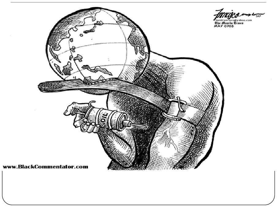
This picture can show how the world is consuming many resources. In fact, it is now consuming many resources such as oil daily that it has become a addiction. This picture can be compared to a human who is being addicted to oil, in this case resources.

This Pie Graph, explains the United States demand for Oil. (2007) The pie graph shows 42% of U.S. Petroleum in the United States. However 58% shows the demand needs from imports to the United States. This can be a major issue because it seems that the United States demands on many resources to be sufficient.
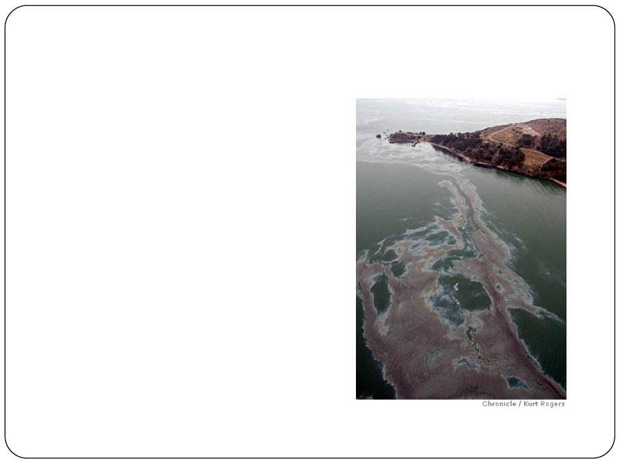
This is really impacting picture because oil is present in the ocean. Foreign oil can be a major issue with aquatic organisms.
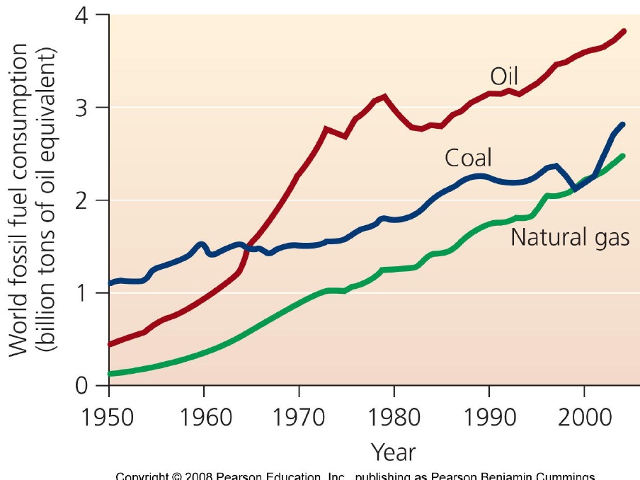
The graph shows an increase in oil, coal, and natural gas. It seems that the demand has increase and consumption. This can be a major problem in the issue once these sources end.
|
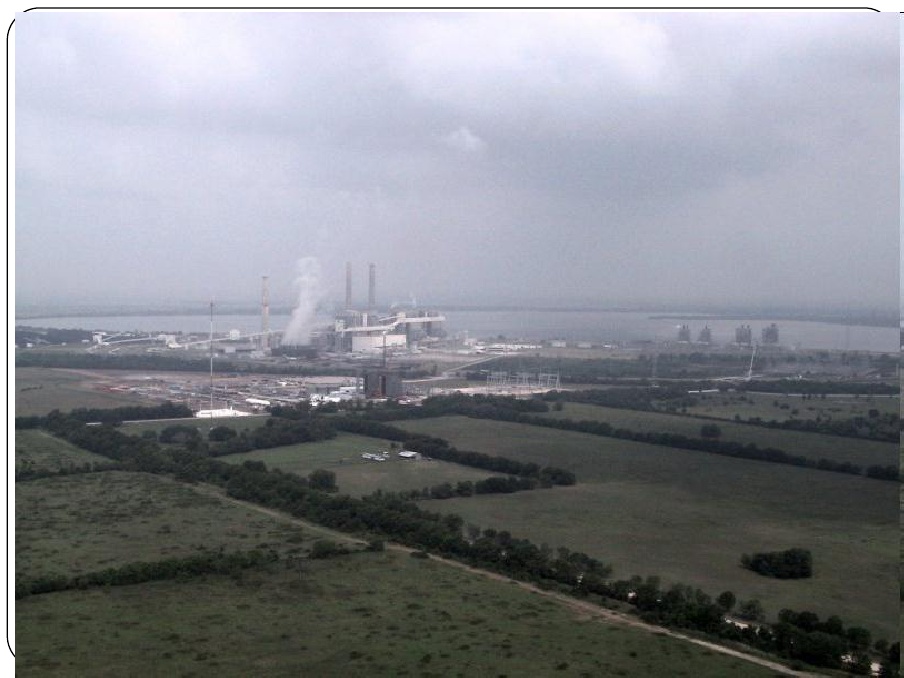
This picture shows an industry that is polluting the atmosphere. In my opinion it comparing the green environment with the along side industry. It actually makes a person reflect on how the world is changing the environment daily.

The picture shows a human who is complaining about the Gas Price. This can be referred to the pie graph next to this picture. The gas price has increased in the United States because the demand for oil is high.
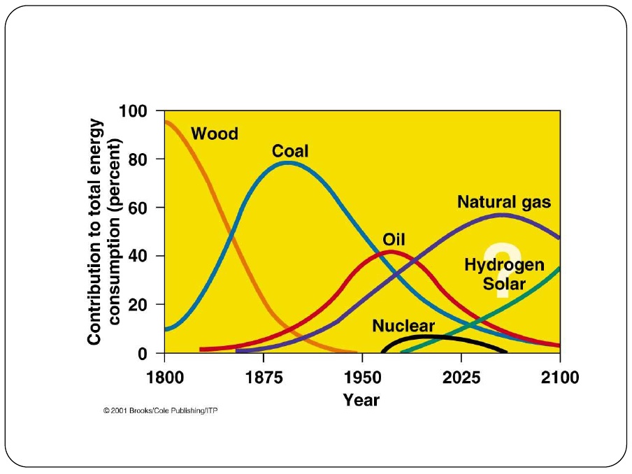
This graph shows the consumption of resources. A person can see that the industries are less dependent on wood. Coal has now increased its demand, today.
ConclusionIn conclusion, the world is now consuming more to satisfy human needs. This can be a major issue for future generations. Seems that humans would need to find new solutions to adapt to their same environment.
|
